Content marketing is notoriously difficult to tie to business goals. Yet, we know it’s critical to success. 97% of businesses say content marketing is an important part of their marketing strategy and content marketing is reported to generate 3x as many leads as outbound tactics.
Still, marketers struggle to show how quality content is responsible for actual revenue, especially when a customer may convert multiple touch points after their first encounter with the brand. A customer may read a business’s blog post, follow that business on social media, then several months later make a purchase after seeing an ad on a different channel entirely.
This is just one of thousands of possible pathways for a prospect to become a customer. While a customer is unlikely to make a purchase after just one encounter with brand content, each touchpoint is critical to inch that customer across the finish line.
So how do you assess the effectiveness of that single piece of content, that may have been the first touchpoint for some, the final push to purchase for others, or somewhere in between?
Measure the impact of your content with this Looker Studio template
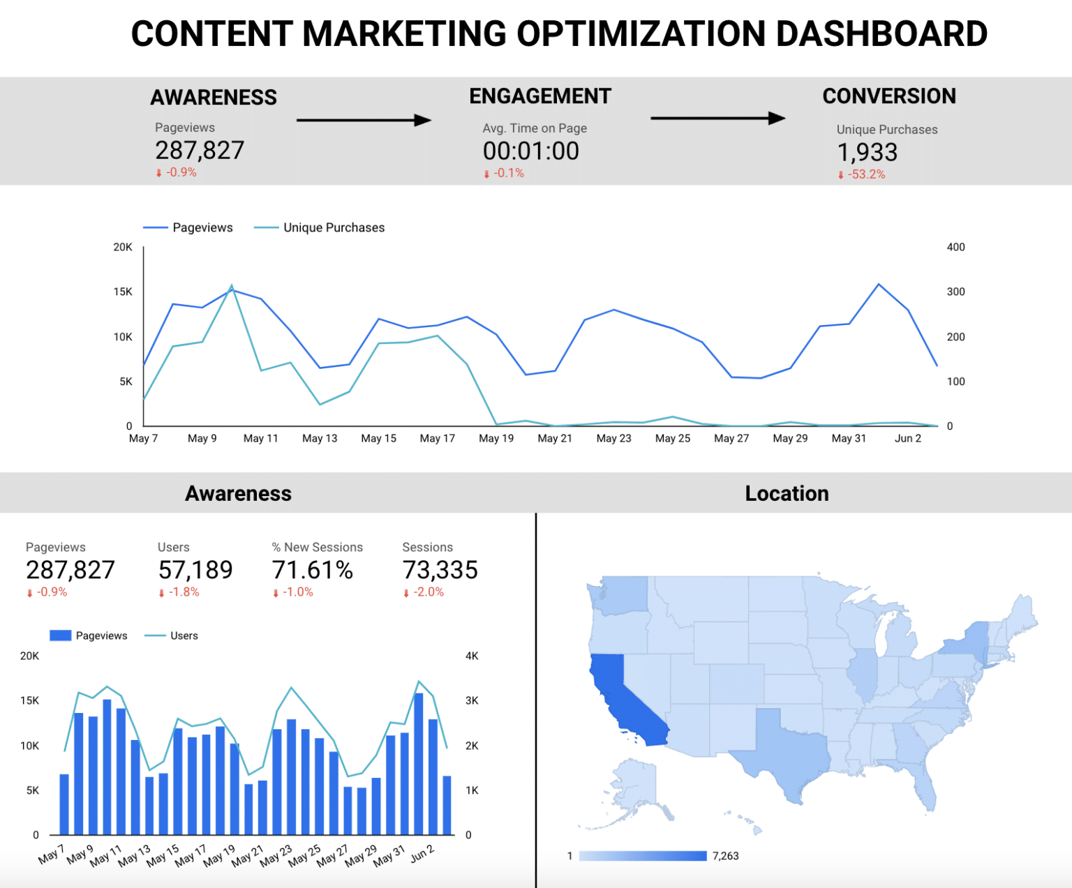
This Looker Studio template (formerly Google Data Studio) is designed to help marketers and businesses visualize the full-funnel impact of their content marketing initiatives. By looking at awareness, consideration, and conversion metrics in tandem, businesses can gauge how growth in metrics such as readership and time spent with content directly funnel into sales.
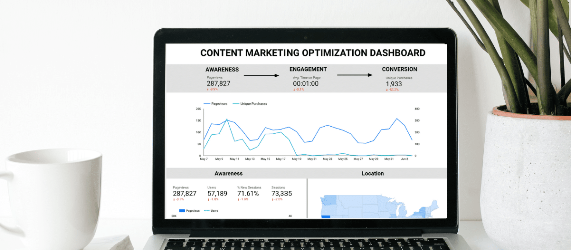
To use this template, you’ll first need to replace the sample data with your own. Click on the three dots in the upper righthand corner and select “Make a copy.” You will be immediately served with a pop up prompting you to select your data source.
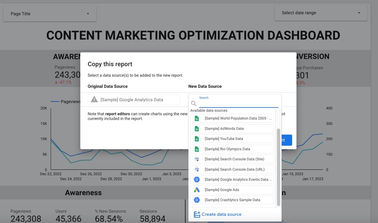
TIP: If you don’t already have your Google Analytics account integrated with Looker Studio, select “Create data source” and follow the instructions here to connect your account.
While this dashboard is compatible with both Universal Analytics and Google Analytics 4, please note that Google will be sunsetting Universal Analytics by July 1, 2023 and recommends users switch to Google Analytics 4 at their earliest convenience. Instructions on how to do so can be found here.
Add your metrics and customize your dashboard
Once you have copied the dashboard and replaced the sample data set with your own, metrics in the Awareness and Engagement categories should auto-update with your own Google Analytics data.
Note that in the process of switching from the sample Google Analytics data to your own, Looker may have erroneously selected different metrics than what was originally in the template. You may want to compare your dashboard with the template to ensure the right metrics were selected.
In the case that they weren’t, or that you would like to swap out some of the metrics for different ones, customization is easy. Simply click on the metric you’d like to change, and select the new metric from the dropdown Chart Setup menu on the right of your screen.
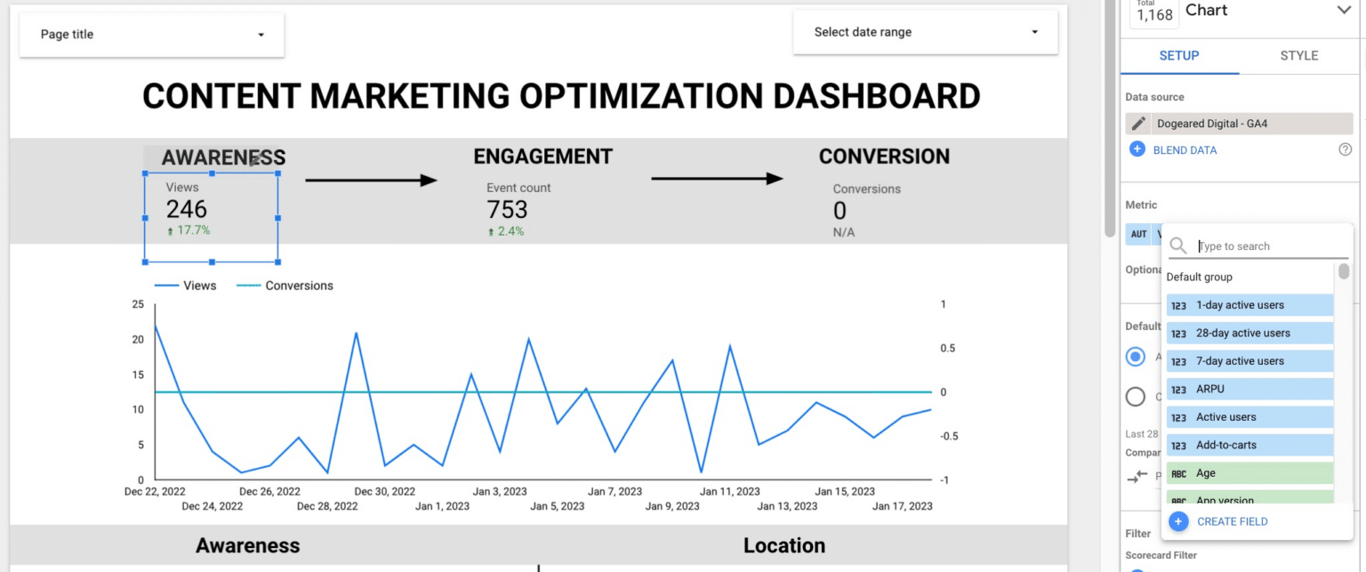
Then, search for the new metric you’d like to use, and you’re all set.
Conversion metrics and custom events
The metrics in the conversion section are custom events that were set up in the sample Google Analytics data set. These metrics will not update with the data source switch, and will need to be set up with your own conversion events in your Google Analytics account. The custom metrics that appear on the template are:
- Unique purchases
- Conversion Pageviews
- Total Value
If you already have custom conversion goals and events set up in your Google Analytics account, you can add these to the conversion section just like you did with the Awareness and Engagement sections. If not, you will need to set up conversion events or goals in your Google Analytics account before you can add them to your dashboard by following the instructions here.
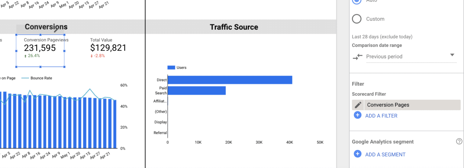
Some conversion metrics, however, can be created directly in your Looker dashboard with the filter feature. This is particularly useful when you want to look at data just for specific pages or parts of your website. You can add Conversion Pageviews to your dashboard using this method.
- First, click “Add a filter” then “Create a filter” in your Chart Setup menu.
- Select “Page title” and add in all of the page titles of your conversion pages. These can be product pages, shopping carts, booking pages – anything that makes sense for your business. The rationale here is that visits to pages with conversion intent are more valuable than other pageviews on your website, because they signal the user is considering making a purchase.
- Name your filter and save it. I named mine “Conversion Pages.”
- Return to the Chart Setup menu and select “Views” for your metric and add your Conversion Pages filter.

View all data for a specific set of pages
Direct your attention to the top left of the dashboard, where it says “Page Title.” From this dropdown, you can select all of the pages you want to see data for in aggregate. For example, if you want to see all of your awareness, engagement, and conversion data for your blog posts, you would simply select them here.
With this drop down menu, you are able to change the pages you’re seeing data for at whim, just like you can change the dates. But you also have the option to customize a more permanent view for the report. Say you want this report to show data for your blog posts, but you don’t want to have to select new posts in the drop down every time you publish them.
Instead, you can create a filter, like we discussed earlier, or a segment, which you would create in Google Analytics. You can learn how to create a Google Analytics segment here. Both filters and segments allow you to view a group of pages together that fit a certain criteria that you determine.
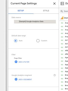
Once you’ve created your filter or segment, go to “Page” in the top menu bar and select “Current Page Settings.” This will open a new panel on the right side of your dashboard next to your data source. From here, you can apply your segment or filter to your entire dashboard.
Deriving actionable insights from your dashboard
The left side of your dashboard features your core full-funnel metrics from awareness through conversion. The right offers basic demographic information including location, age, and gender, as well as traffic source to show you how your users are getting to your website. Of course, you can swap out any of these metrics out for your own KPI’s to better align with your customer journey.
The selected awareness metrics, including pageviews, total users, and sessions, focus primarily on traffic quantity. Since awareness is most often affiliated with impressions, metrics were chosen that reflect how many people and times your website was viewed.
For engagement, metrics are more aligned with how people interacted with your website, and include average time on page, bounce rate, entrances, and exits. While awareness depicts the act of getting to your website, engagement shows you how they consumed the content once they got there.
Conversion metrics are the most niche, and will need the most customization as every business has a different way of defining a conversion. For e-commerce businesses it may be a purchase, while for B2B it may be lead generation. In addition to a direct conversion, the metrics here should indicate intent, and may include visits to product pages, filling out a contact form, or a myriad of other actions.
Each metric in the dashboard compares the selected time period to the previous period so you can see how you’re progressing over time. While conversion metrics are always going to be the most important to your business, awareness and engagement marketing are critical touchpoints for the prospect to eventually make that purchase.
While the number of, say, pageviews, in a given period doesn’t tell you anything about how much revenue your business is bringing in at that moment, it does signal new people are beginning their customer journey. And tracking how your early-funnel metrics are growing or declining over time will illuminate ways to optimize your customer journey.
Ideally, if you see a substantial increase in your awareness and engagement metrics, you should see an increase in your conversion metrics down the line. How long that will take depends on the length of your buyer cycle, but ultimately the pattern of growth early in the funnel should consistently correlate to an uptick in conversions.
If it doesn’t, you know that you’re bringing the wrong people to your website and should look into new awareness marketing channels and tactics. If the dropoff is occurring at the engagement level, it’s time to take a hard look at your website content. Why isn’t it sticky? How can you change up your content strategy to entice people to stay and learn more?
Alternately, if you do see an uptick in conversion metrics following an increase in awareness and engagement, you know you’re doing something right. Be sure to make a note of how long it took to see the growth at the bottom of the funnel, and watch the cycle over time to make notes of patterns in time and behavior. The more you know about your cycle, the more you can optimize it.
Marry content marketing and measurement
Content marketing is a critical part of your marketing arsenal in 2023. By customizing this Looker Studio template, you can showcase the contributions of your content marketing work, closing a gap marketers and businesses have struggled with for years.
When you drive potential customers to your website, they’re expecting to be met with a plethora of useful, intriguing, and entertaining content. This is no longer an optional step in the customer journey for most consumers in 2023. With your full-funnel metrics laid out in your dashboard, you’ll be well equipped to analyze not just which content is getting eyeballs, but how it’s impacting your prospects’ buying decisions.
This post was originally published on Content Marketing Institute.

